— PROJECT NAME
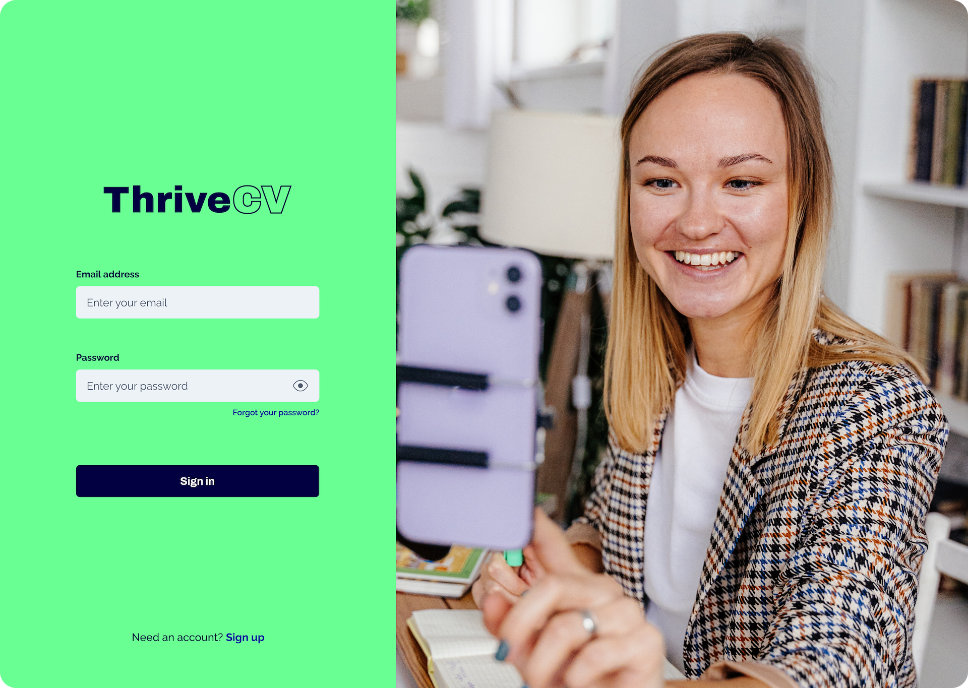
ThriveCV
— ROLE
User researcher UX Designer UI Designer Brand design
— DATE
12/08/2023
ThriveCV was built as an MVP platform for graduate recruitment. The initial idea that the client came to us with was a video CV site to appeal to Gen Z, which would help get their personalities and interests across to employers and help smaller employers stand out in a competitive market. I worked on the brand look and feel, and was the sole product designer on the project, working on the UX and UI.
The Problem:
In graduate recruitment, traditional methods were failing to showcase the full spectrum of candidates' personalities and soft skills. With minimal work experience there was little to set candidates apart and smaller companies that didn’t have a graduate scheme struggled to stand out to graduates.
The Solution:
The ThriveCV MVP sought to fix these problems by creating an innovative video CV platform. By enabling graduates to showcase their personalities authentically and allowing smaller companies to present themselves in a more engaging and interactive way, Thrive aimed to improve both sides of the recruitment equation.
My Process:
My research began with in-depth user interviews about the experiences of both recruiters and recent graduates. Recruiters expressed frustration over the challenge of identifying which candidates were still active, the time spent sifting through applications, and the back and forth of interview scheduling. Graduates’ biggest frustrations were that they had to fill out endless forms for each job so it didn't feel efficient, that pay wasn't shown and that they didn't hear back even if it was a rejection.
As this project was an MVP it was important to me to focus on what I could add in the timeframe that would give the most value to the user. In order to help discover the most-wanted features I ran a test called 'buy a feature' at the start of the second round of testing, where users were given 5 'coins' each to spend on a list of 10 or more potential features. I then reviewed the top scoring features for both sets of users and scoped out their design and development time to work out which were desirable but also feasible within the MVP timeline alongside the main build of the platform and core functionality.
One of the big decisions we made early on was to focus on a web app rather than creating a mobile app. From the research all recruiters preferred to complete their recruitment tasks on a computer compared to a phone and so did the majority of graduates, so in order to focus on creating the most features the mobile app development was paused until post MVP. Although almost everyone preferred to work on the computer for these tasks, a few said they'd like an app to do a some things on the go, so this is planned for the future.
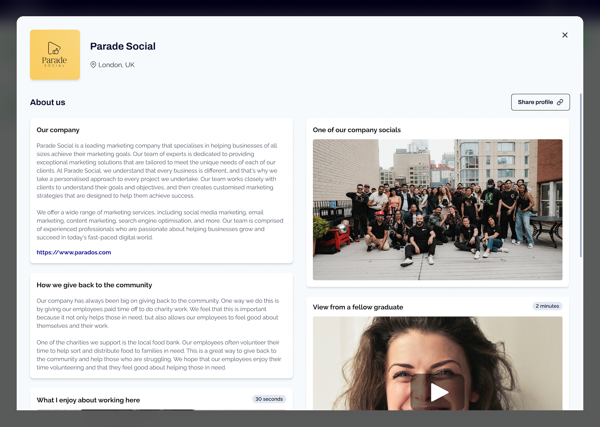
First of all I worked with the Thrive founder to create an MVB (minimum viable brand) we could launch ThriveCV with. My solution was something that was eye-catching and fun to appeal to Gen Z, but was professional enough to sit well with recruiters
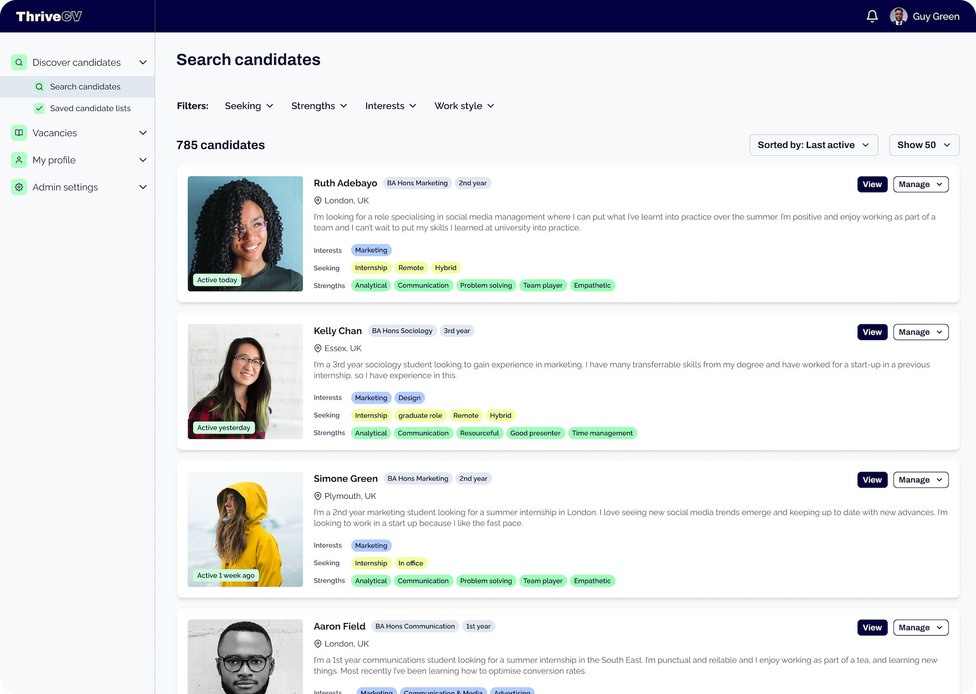
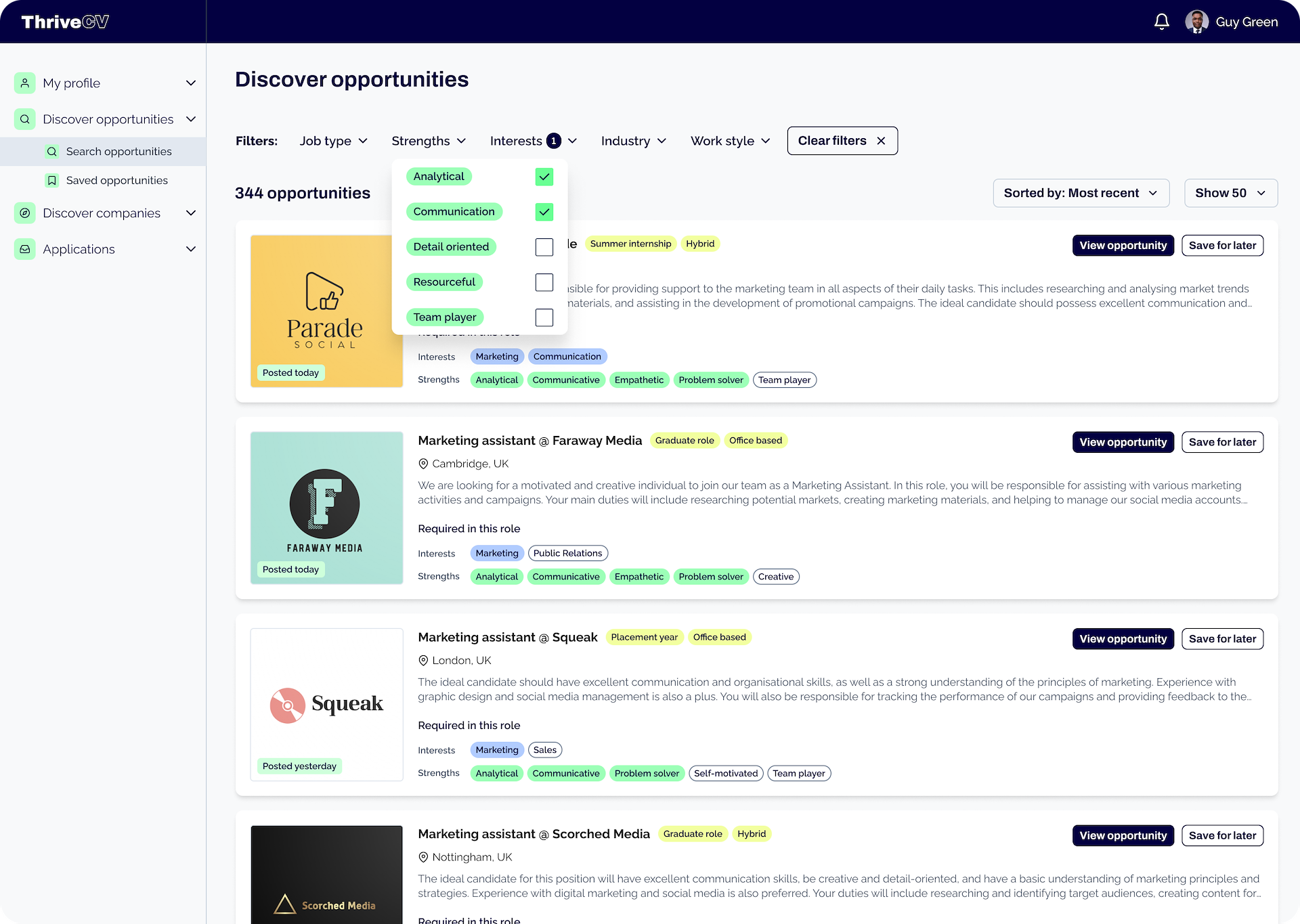
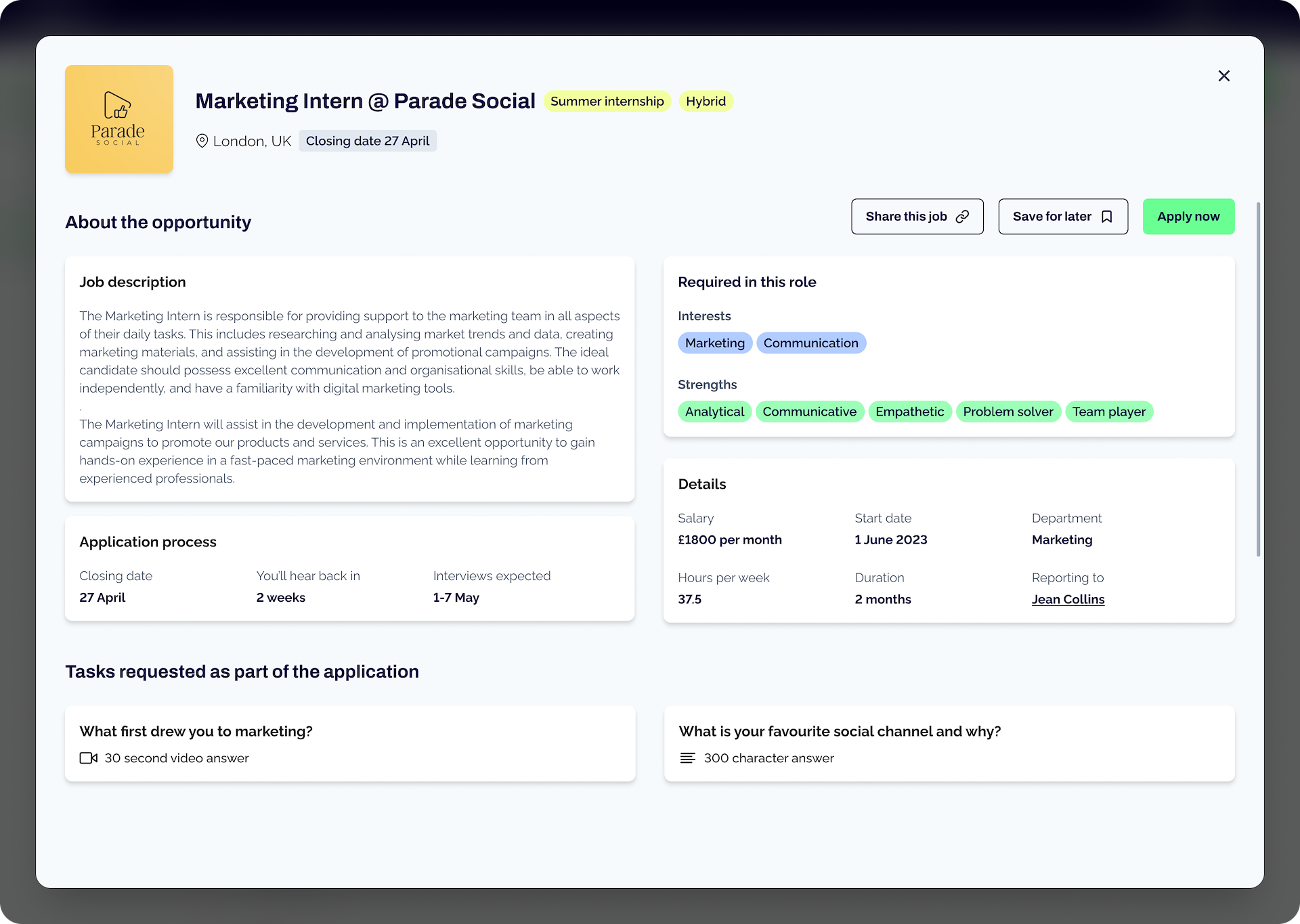
My design solutions focused on effectively resolving pain points. Some pains and chosen features were quite easy wins in terms of ease of building for the value they created. For the recruiter side we chose to prioritise a last active timestamp so that recruiters weren't contacting people who were no longer active, their top frustration. This also included the ability to sort candidates by last active. I also chose to implement a filtering system based more on soft skills and interests to help with the inefficiency of sorting through multiple applications. This was easier to implement than search for MVP but also added value. Another big pain point was scheduling interviews, but this was too complex and had too many dependencies to implement for the MVP so this is planned for later.
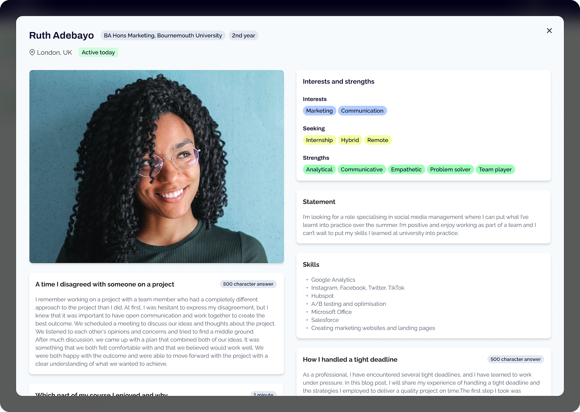
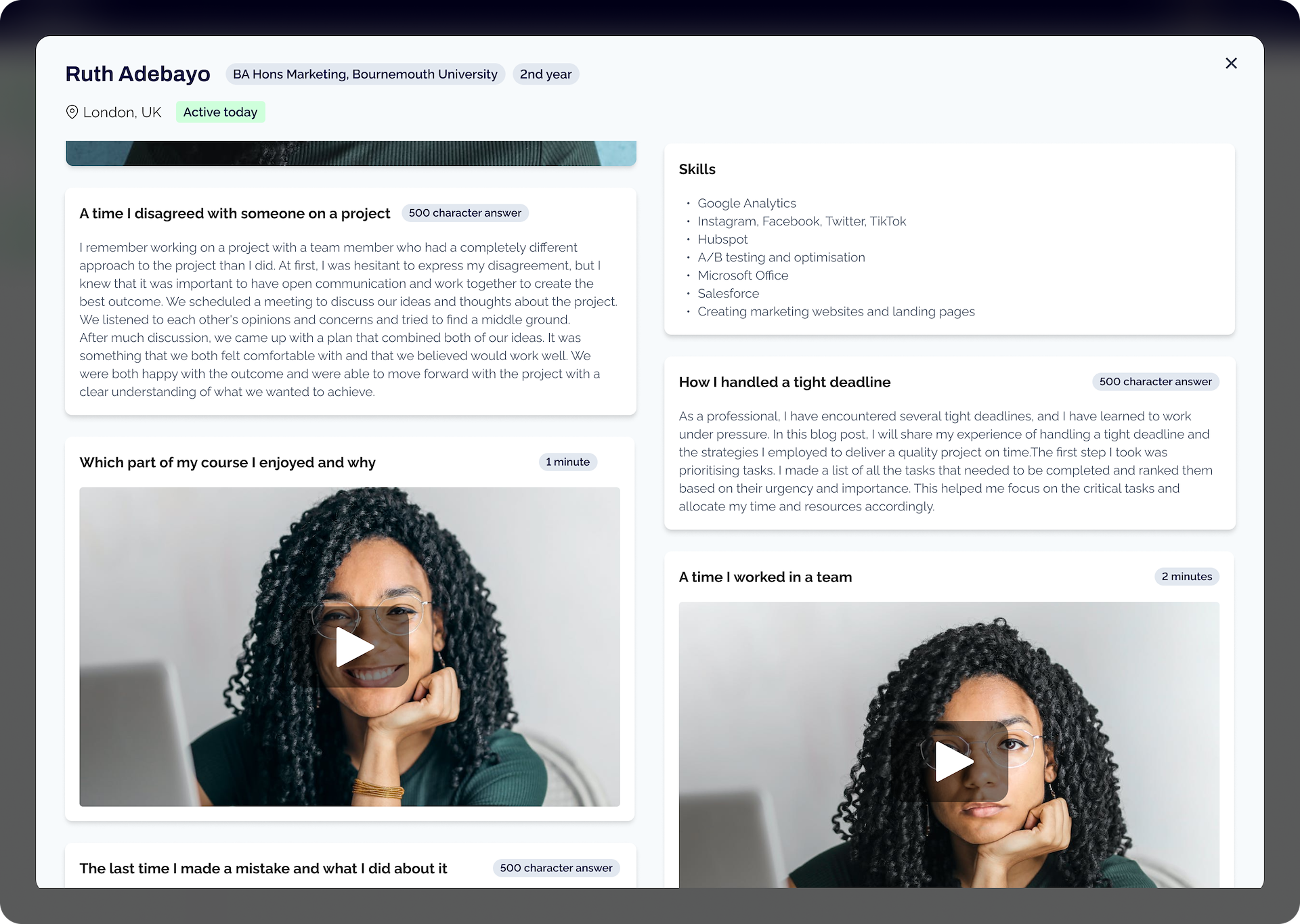
For the graduate side of the platform my solution was to create a main profile they filled out once and then could send their profile as an application to multiple jobs, only filling out a couple of additional short tasks for each one if requested by the employer. This meant that their application process is made much more streamlined and efficient than writing the same thing over and over on different sites. In the research most graduates were positive about submitting videos as part of the application but some were hesitant so we also included the ability to respond in different formats. To fix the other big graduate pains I also made the pay information compulsory and displayed the expected time before they would hear back about their application.
In the design phase I used Figma to create wireframes and flows and then created higher fidelity designs and turned them into interactive Figma prototypes to get early user feedback. Usability testing participants took part in a second round of interviews to help decide features needed in future sprints and then used the prototype to perform a set of tasks in remote usability testing. The testing generally went well and both candidates and recruiters were able to find what they needed and complete tasks, but there was some confusion over terminology which affected usability. For example 'search candidates' made recruiters think they were looking through candidates they had already shortlisted rather than finding new ones, so I renamed this section 'discover candidates' instead and this performed much better in the second round of testing. I also changed the name of the tasks that recruiters could set candidates from 'challenges' to simply 'tasks' as the word challenge was perceived to be something you either succeeded or failed at and had negative connotations.
As the MVP took shape through iterative sprints, we added any additional core features that were necessary from a recruitment platform and as many features from the research as possible within the timeframe. This resulted in a platform where you could register as both a recruiter and a graduate, fill out an interactive personal profile and company profile, post a job, apply for jobs with interactive tasks and discover and filter jobs and candidates, all within less than 6 months from initial idea.
Thrive CV soft-launched to a few hundred students in April to very positive feedback and the main launch is planned next month, I’m excited to see it grow.